
FAB-PRO
A COMPREHENSIVE REBRAND
After more than 30 years as Southern California’s premier fabric care specialist, Fab-Pro had outgrown its original 1994 identity. This rebrand positions the company as a modern, premium partner to top interior designers, elevating its visual presence to reflect the level of care, craftsmanship, and trust behind its work.
As Head Designer for this project, I led the development of a new logo, refined brand identity, and supporting marketing collateral, balancing legacy and expertise with a more contemporary, design-forward aesthetic.
LOGO DESIGN | BRANDING | MARKETING COLLATERAL | WEBSITE DESIGN | SOCIAL MEDIA
Created at Poolside Agency Role: Head of Design
PREVIOUS IDENTITY
The original identity no longer reflected Fab-Pro’s premium positioning, with a visual language that felt outdated compared to the high-end interiors market the company serves.

Original Logo


Previous Marketing Materials
THE REBRAND
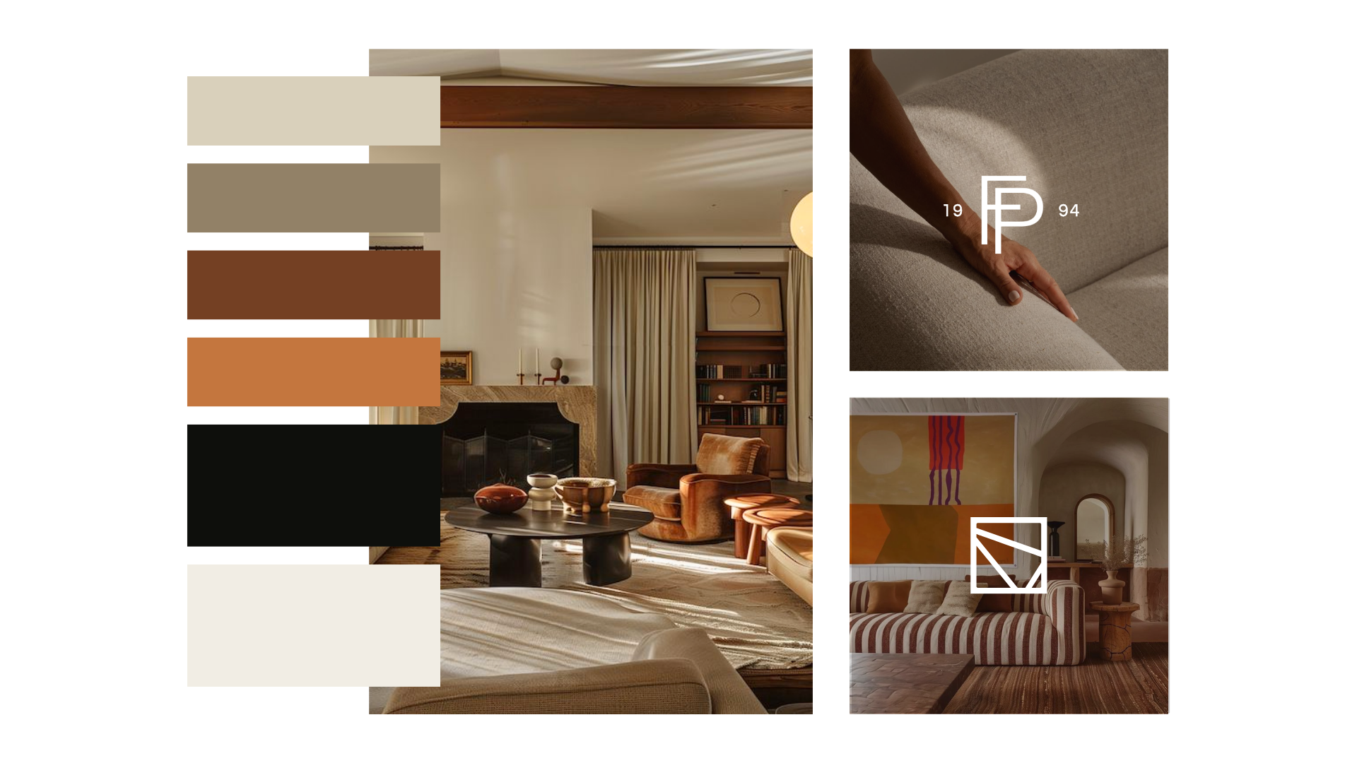
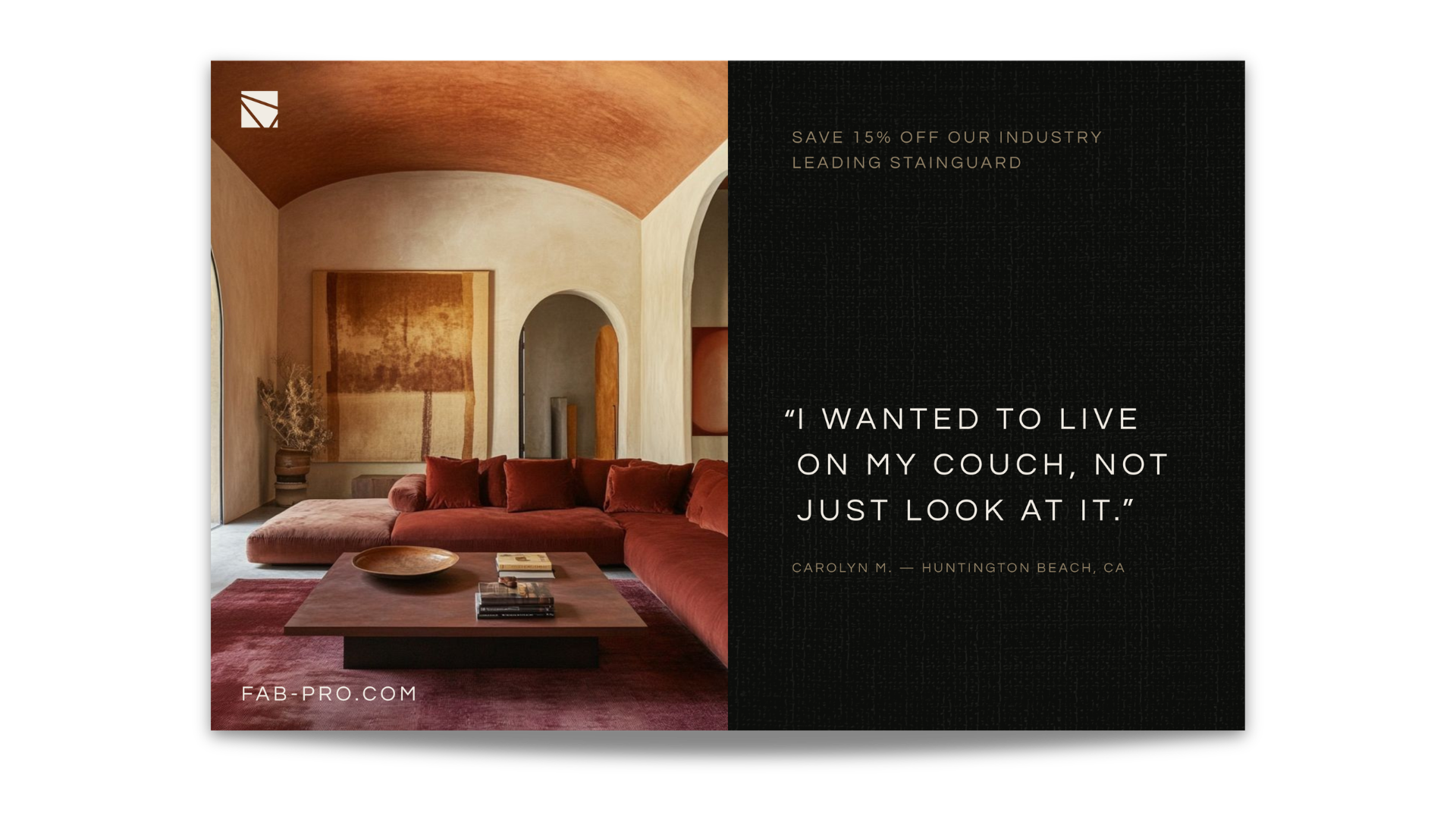
The updated brand system draws inspiration from the elevated visual language of luxury interiors and furniture brands, creating a system that feels refined, trustworthy, and aligned with Fab-Pro’s high-end clientele.

Logo Suite & Color Palette
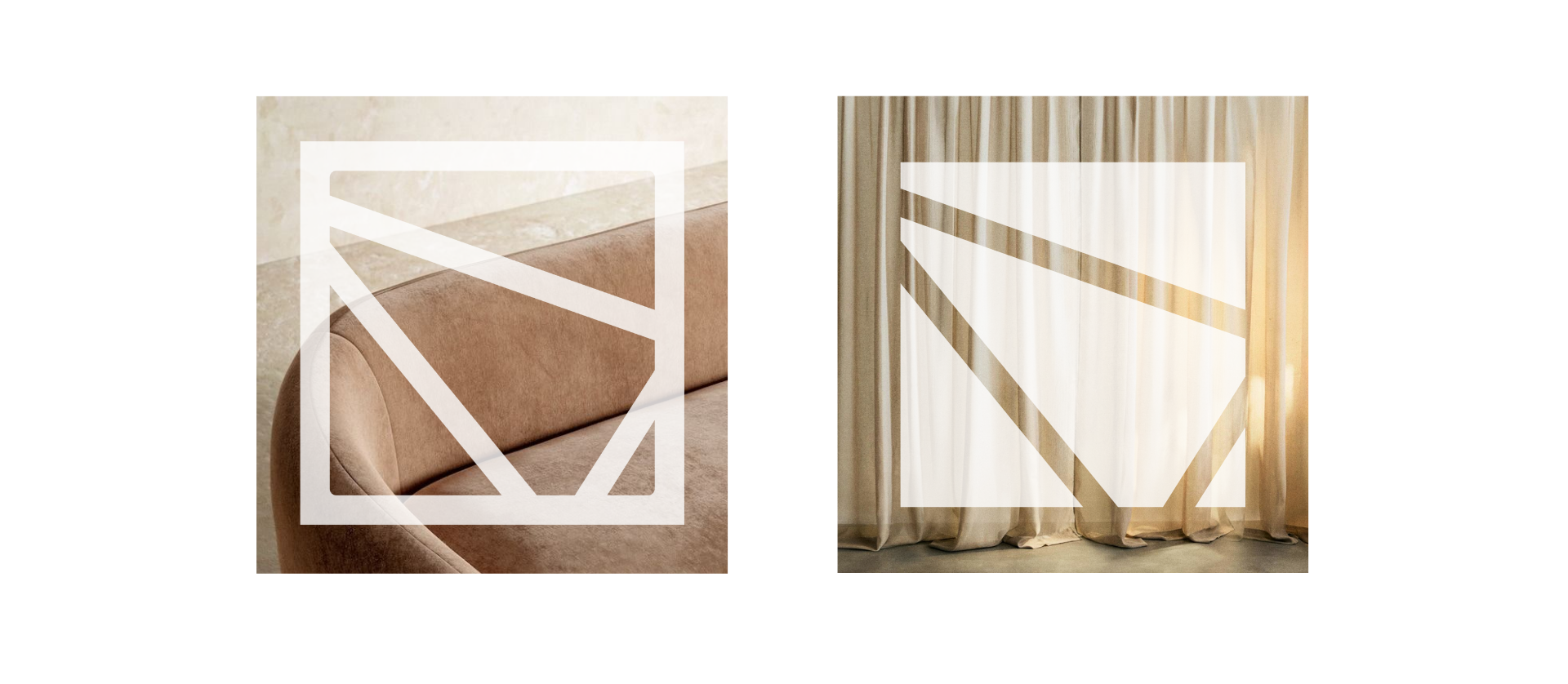
This icon abstracts the geographic footprint of Fab-Pro’s service region, connecting Santa Barbara, San Diego, and Palm Springs.
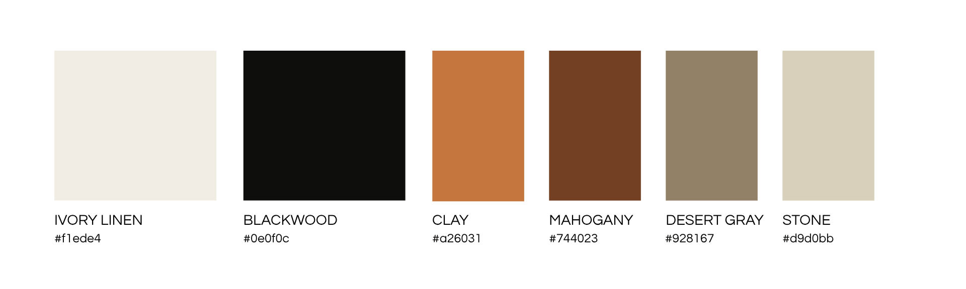
The refreshed palette softens Fab-Pro’s recognizable orange with warm, neutral earth tones, resulting in a visual system that feels modern, calming, and premium.
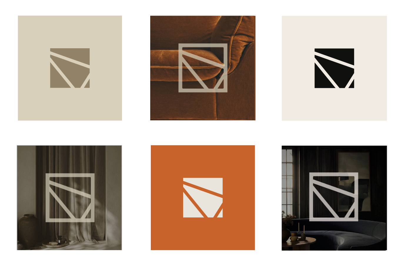

Color Palette Application
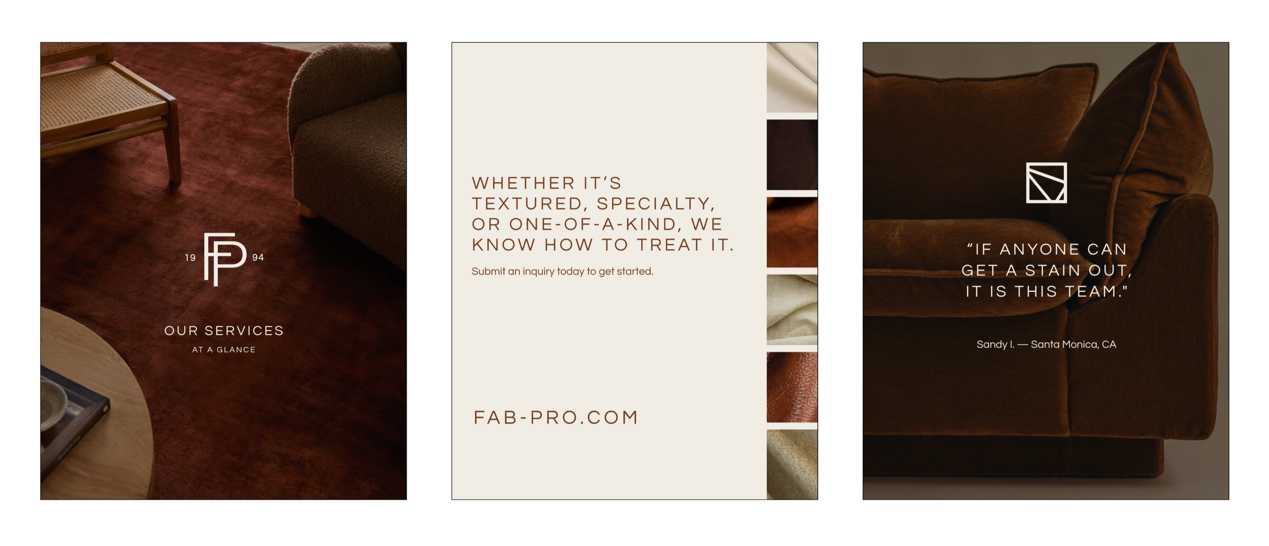
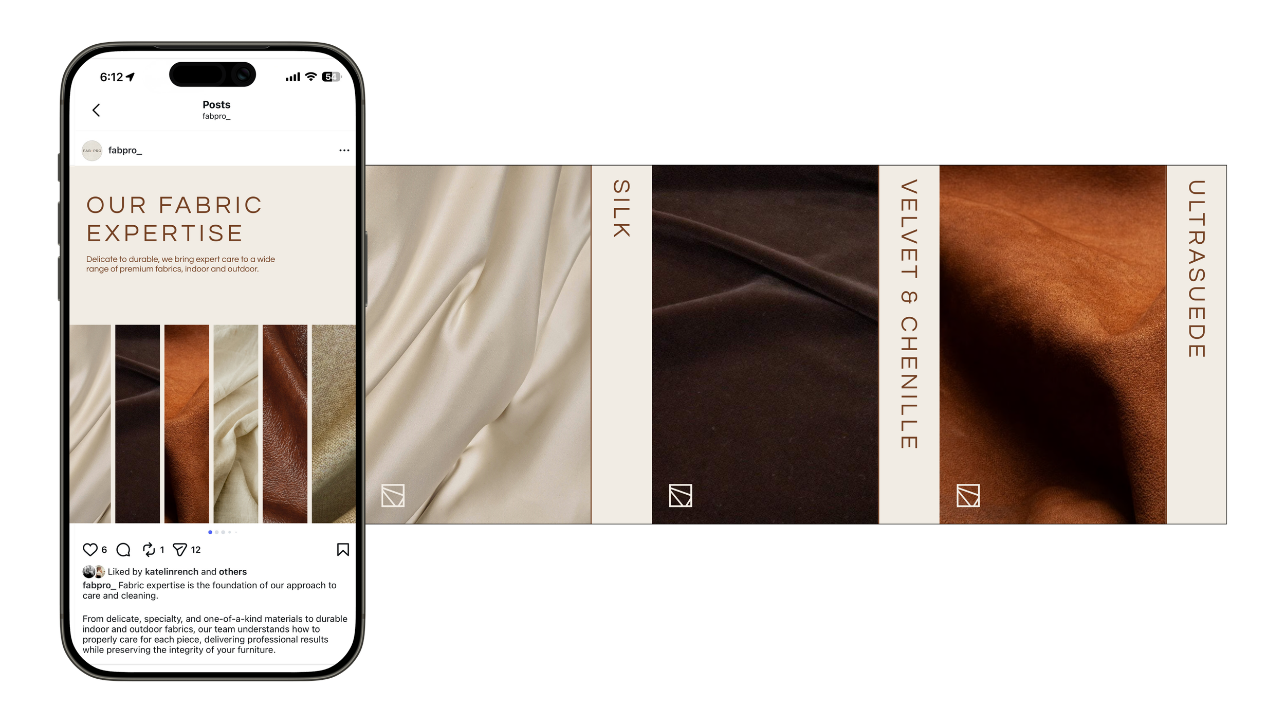
Curated Social Media Feed
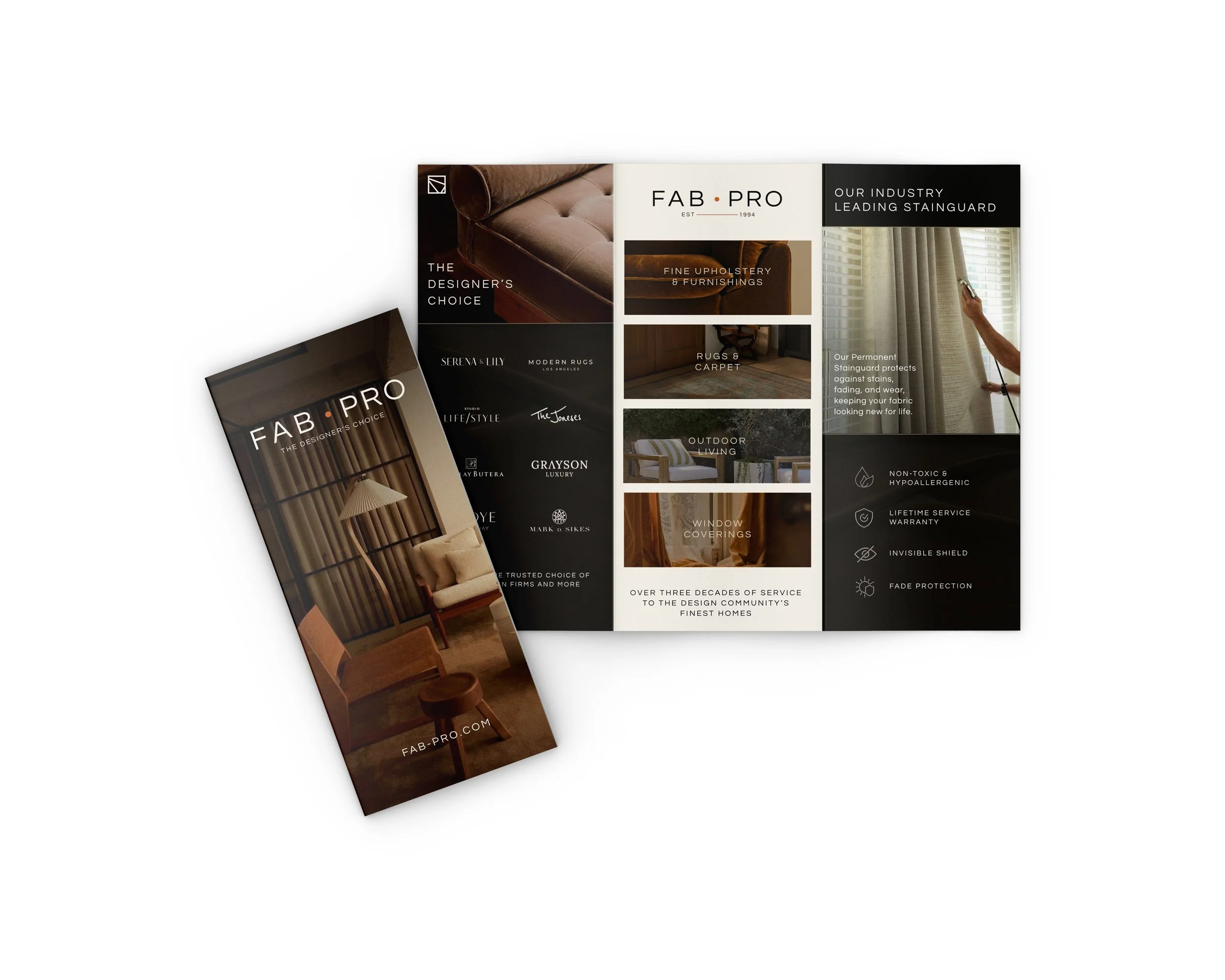
Trifold Brochure
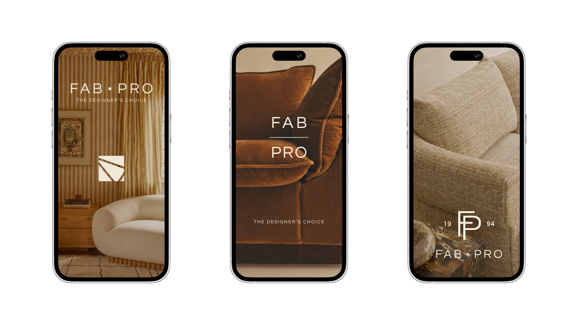
Digital Brand Application
Mailer
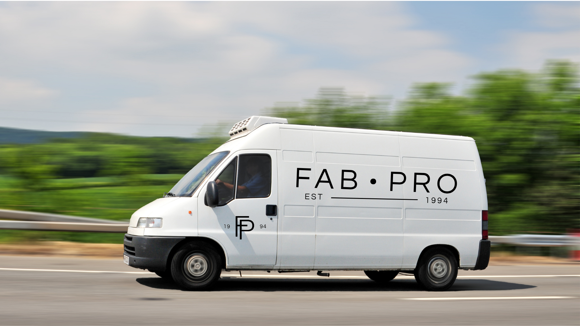
Van Wrap